
Note: This is a part 2 of 2, but it lands with practical applications of its own.

Skeuomorphism
Skeuomorphism is one of those things you can’t unsee once you know what it is. But there are really two versions of it: incidental and intentional. So first, a rough definition:
Skeuomorphism is a design concept where objects or features imitate the design and function of older, more-traditional objects, even when not necessary for functionality.
So, when phones switched from a rotary dial to a number systems, many early designs kept the numbers in a circle. This was an example of intentional skeuomorphism because you want something to feel familiar. Too much innovation can scare people and limit adoption. A skeuomorphic design helps increase early adoption.

Incidental Skeuomorphism
There is also an incidental version of this. Whenever there’s a leap in technology, there’s not just apprehension towards adoption; there’s also a lack of understanding of how that technology might be used.
So when the internet came out, the first uses were just digital versions of preexisting forms of tech.
Mail 👉 Email
Classified ads 👉 Craigslist
Newspaper 👉 Digital newspaper
This is where skeptics often scoff at new technology: “it doesn’t feel that different than what we had before!”
Unintentional skeuomorphism is important, but often isn’t convincing enough on its own. Especially since the earliest versions of a new technology are the most expensive. It’s hard to convince someone to pay more to have a similar level of benefit for a slightly different experience.
Intentional Skeuomorphism
But it’s the intentional skeuomorphism that wins people over to new technologies. I think one of the reasons Apple wins when it comes to new technology is they are winsome with their design. Let’s take the iPhone: here we had a huge paradigm shift from typing on a tactile keyboard to tapping on glass. Apple didn’t take this for granted: they created a clicking sound, made the buttons appear 3-D, and made them get larger as you typed one to let you know you tapped the right key.

Early apple UX design had very intentional appeals to physical and familiar products. And as we became more used to tapping on glass, the buttons lost the 3-D look and the clicking sound has almost become a cultural faux pas. And though they’ve tended towards more flat design, Apple continues to use skeuomorphism when creating new products and markets. In early Apple Vision Pro commercials, the floating screen is shown to have shadows. This spatial context is, in a way, Apple helping us adjust to a transition in augmented reality.
Intentional Less
Last week, we talked about post-satisfice-less—it’s easy to think transition will be easy; let’s remove barriers! But all change is first experienced as loss. A four-lane to three-lane right sizing of a road is seen as a loss of a lane even if it doesn’t affect traffic. Any progress we make in urban development will require not only written education but also tangible, felt benefits.
The beauty of well-done skeuomorphic design is that it shows rather than tells. It isn’t saying “Look at this, isn’t this good?” but it is instinctual.
Echo-Urbanism: Skeuomorphic Urban Design?
To some extent, there will be straight skeuomorphism that will help in urban design; after all, most architectural forms are a callback to distinct styles even if some aspects are purely ornamental and no longer have a function.
But I think that, as we attempt to make more delightful urban places, we need to call back to experiences people innately understand. Something I think of it as echo-urbanism, which is a term I made up, but I think needs to exist.
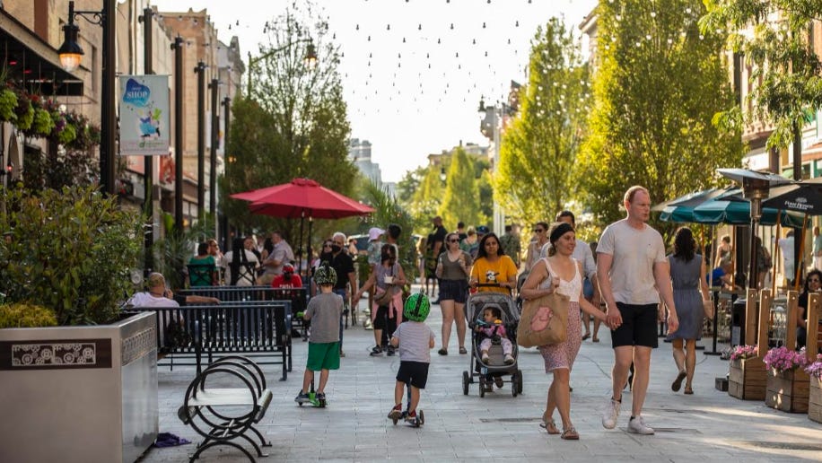
This idea of echo-urbanism is trying to make a place feel like it’s supposed to be there, even if it’s new. Any car-loving American that goes to Europe rarely walks around old town Ljubljana, Slovenia and thinks it needs more cars.
In this way, new plazas and pedestrian malls should aim for a classic aesthetic. This is both because we know: 1. this is what works, and 2. it’s more likely to appeal to people who may have initially opposed the project.
Wooing Beyond Skeuomorphism
Beyond that, we need to strive to make designs more winsome. I recently saw Barkha Patel give a keynote address where she talked about how they added ponytails to bike lane symbols to let women know the bike lane was also for them.
It’s pretty standard knowledge that young males are less risk-averse and make up a disproportionate amount of cyclists. Beyond Patel and Jersey City merely making a bike-lane safe enough for everyone, they communicated it in the symbols along the lane itself.
This small change (technically not MUTCD compliant) isn't an example of skeuomorphism, but it embodies a similar spirit: showing people who might struggle with the transition that the change is also for their benefit. I think of this as design that woos.
So what does this mean?
To me, it means that even if the work of change is exhausting, we still need to create delightful and meaningful transitions. We should never assume that forcing change is enough because it will often be met with resistance, which will continue. However, through thoughtful design for transition (skeuomorphism), creating new spaces that echo familiar desires (echo-architecture), and being mindful about winning people over (design that woos), we can reduce the friction for future changes.
No battle is the last battle. Most of the people who oppose us are actually on our side; they just don’t know it yet.
P.S. If you’re interesting in learning more about this or going deeper into this, I first heard about this idea in the book Subtract, by Leidy Klotz.
Great read. Although i'm not sure if this is correct, I think about skeuomorphism when I think about how I would change/envision the suburbs down in Central Florida. I love the idea of traditional mixed used neighborhoods for getting people out of cars, walking and building community but when the vast majority of neighborhoods are just SFH's with front and rear lawns, changing from that to 2-3 story mixed use seems impossible. Skeuomorphism would be helpful here because introducing small, Accessory Commercial units to the front and ADUs to the rear wouldn't change the character of the neighborhoods and it feels a lot more doable than redoing the entire place.
Thank you for the new ideas and thoughts. Your truly one of my favorite Tiktokers/commentators/bloggers.
Echo-Urbanism… Yeah, great word!